WM Real Estate Identity
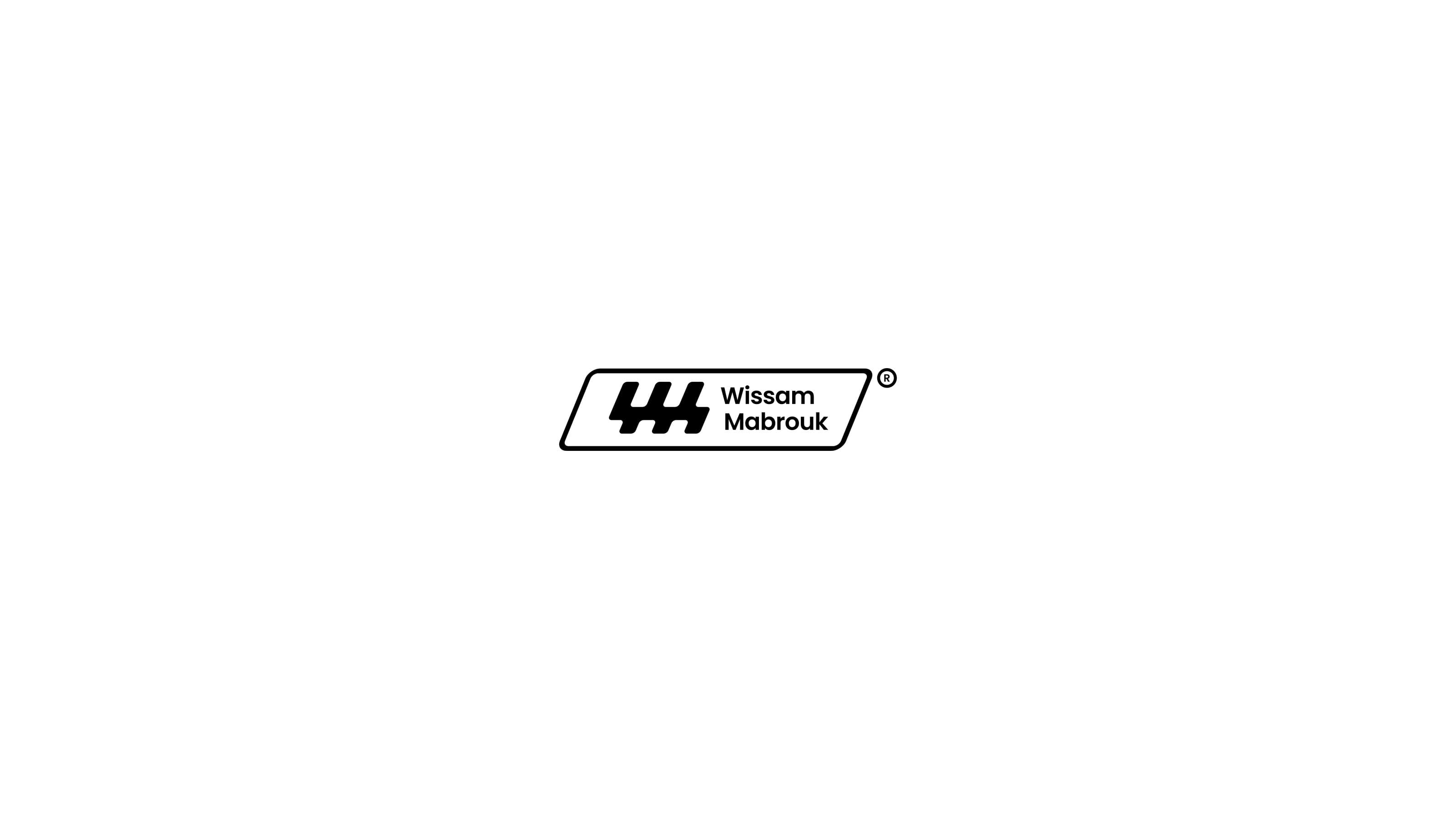
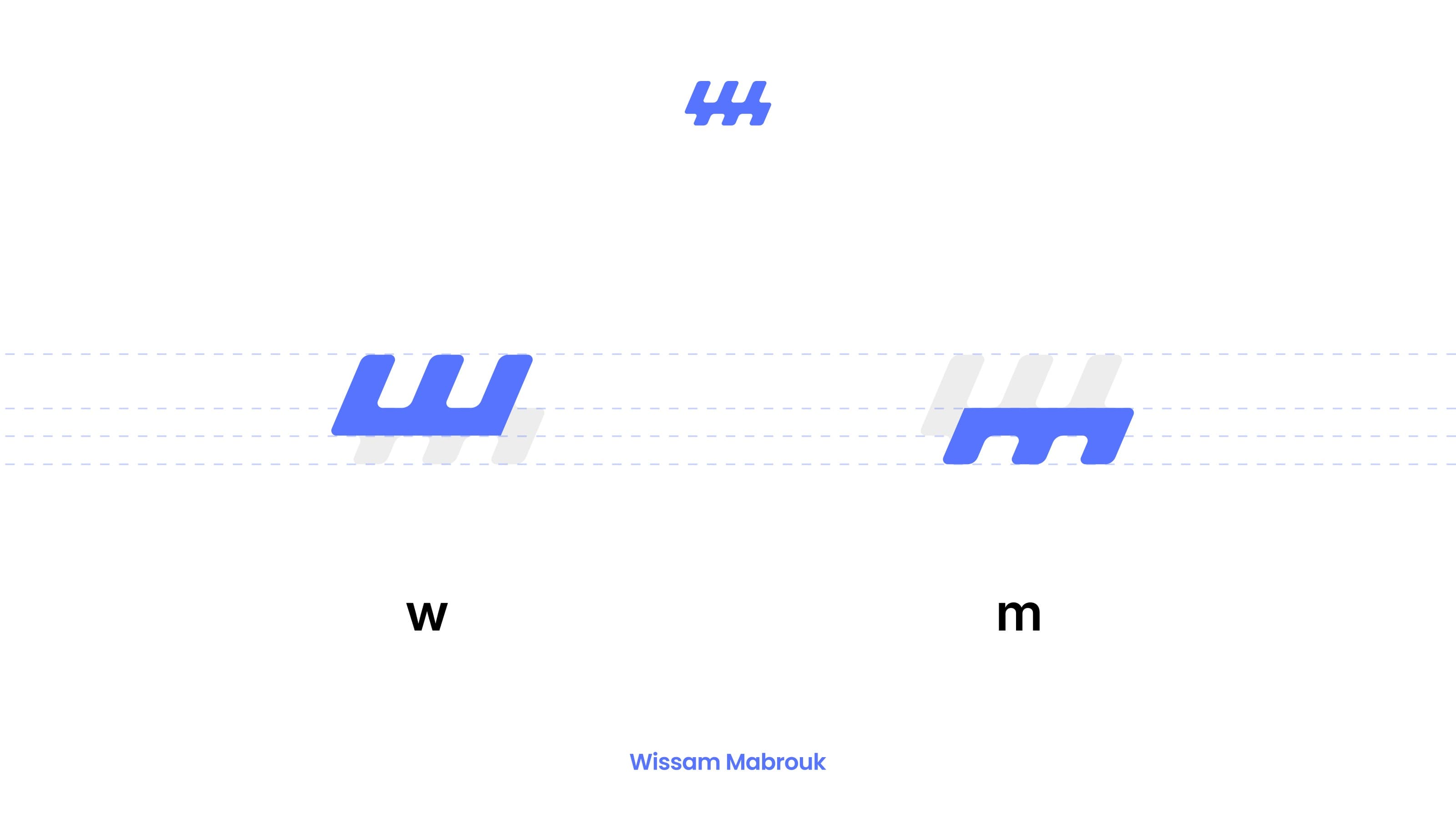
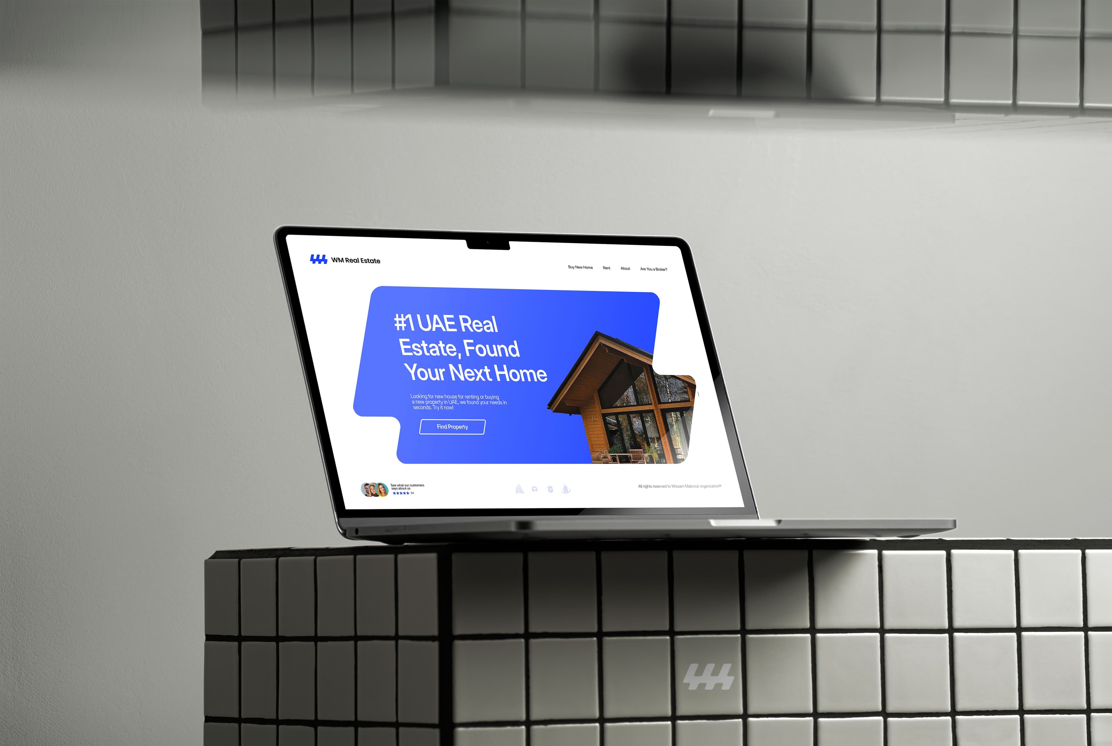
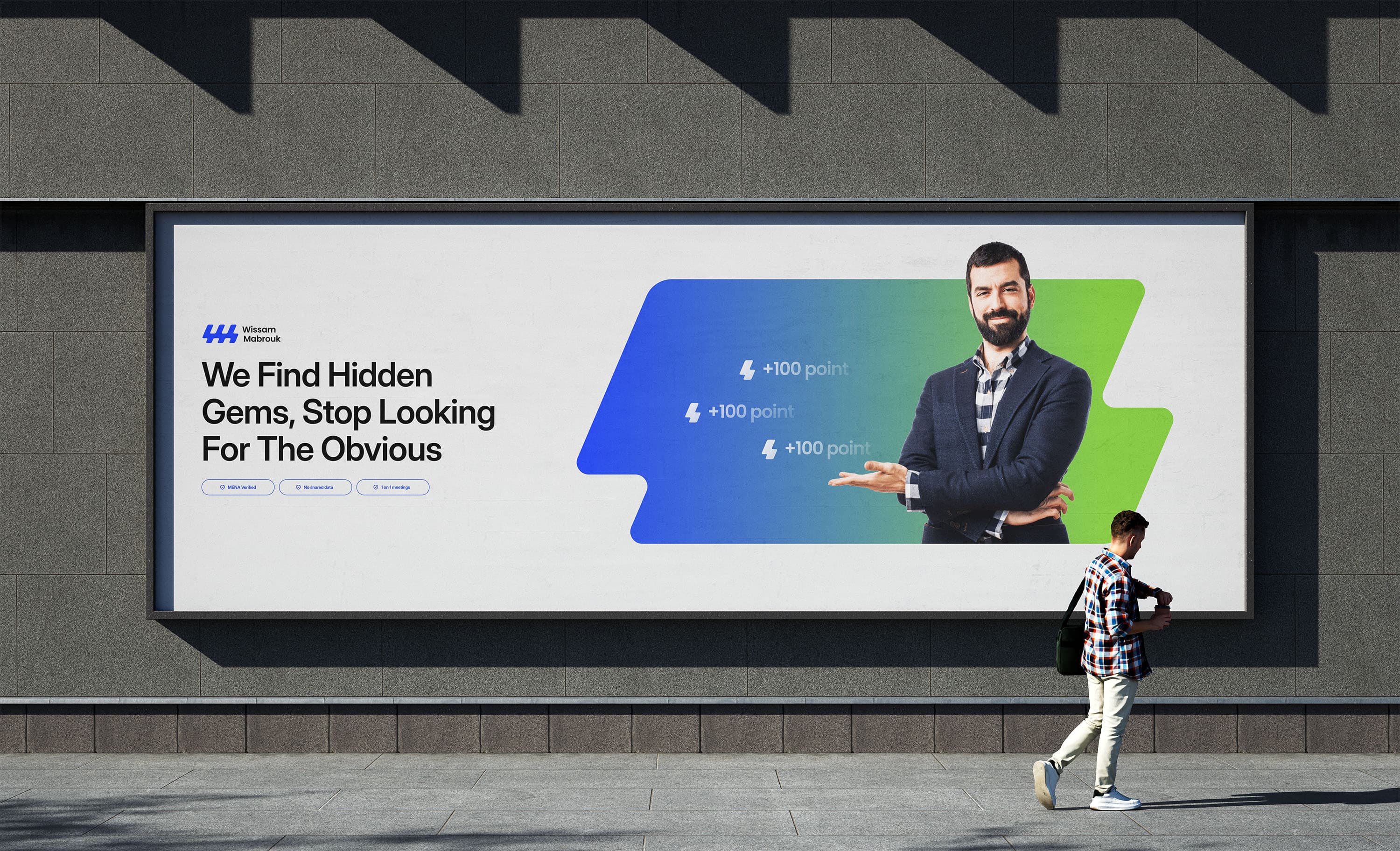
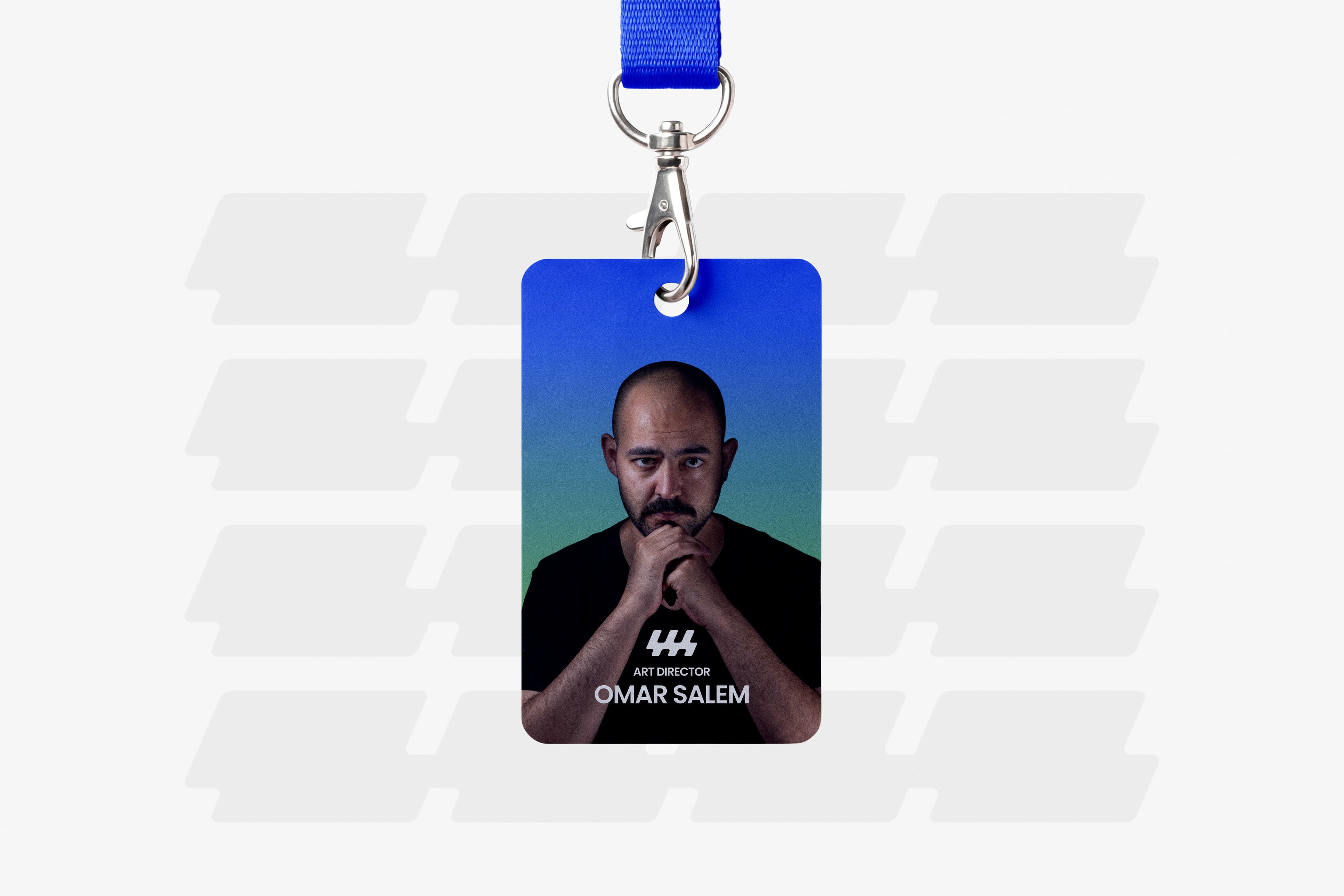
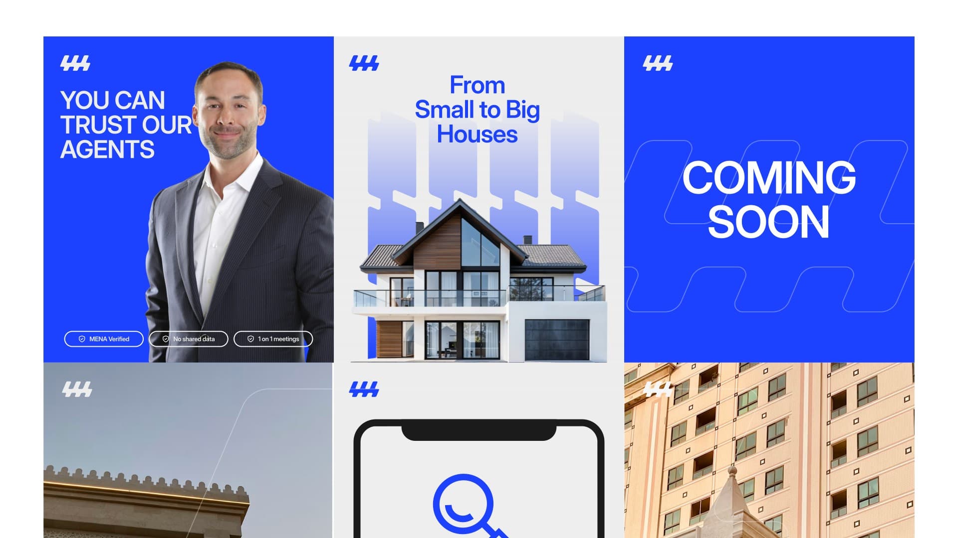
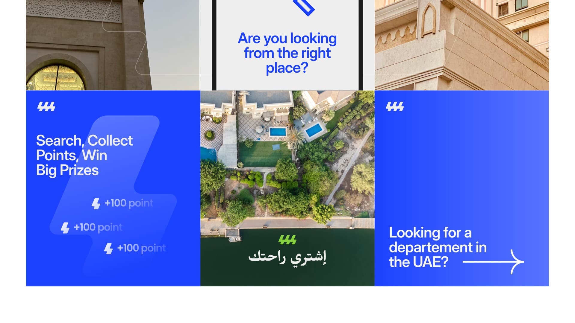
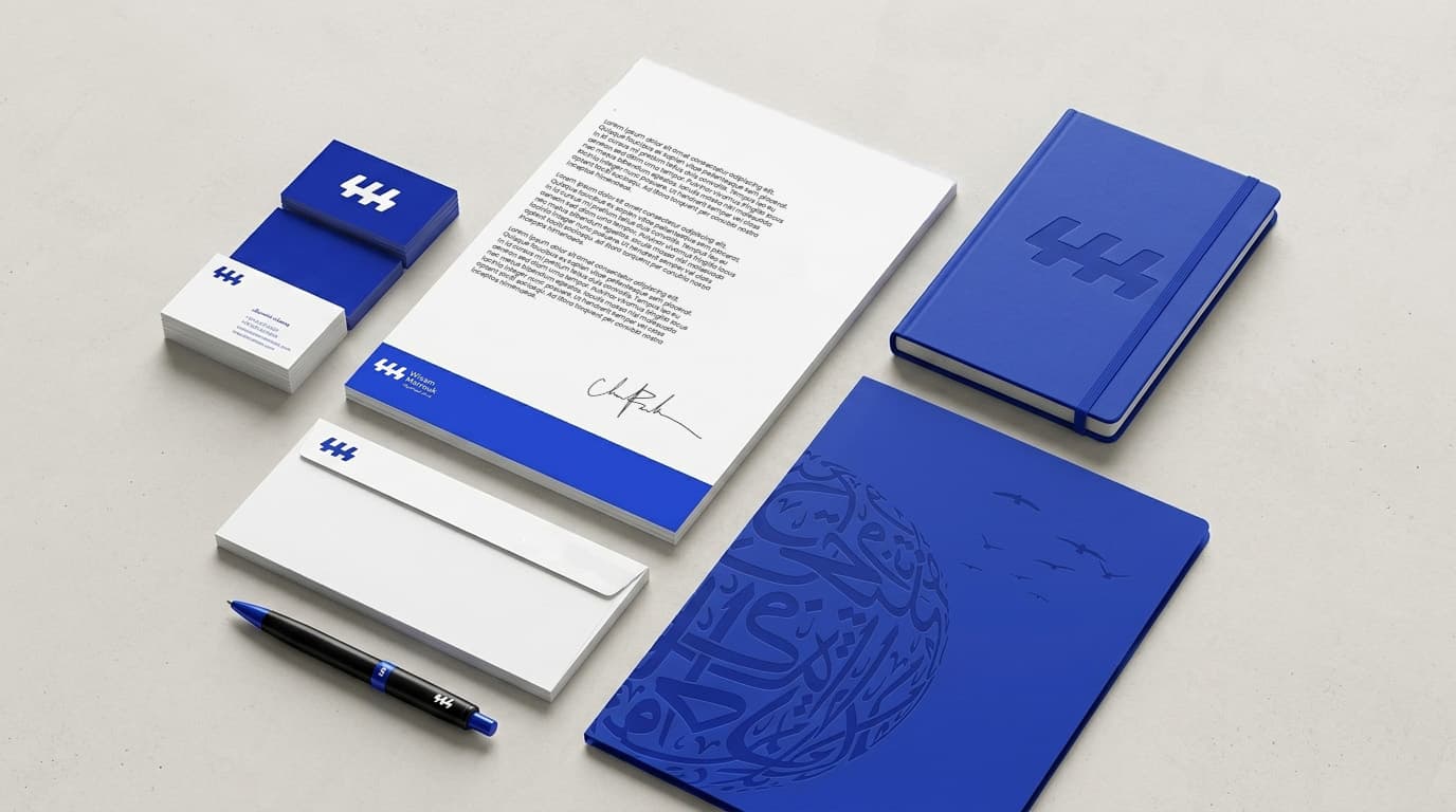
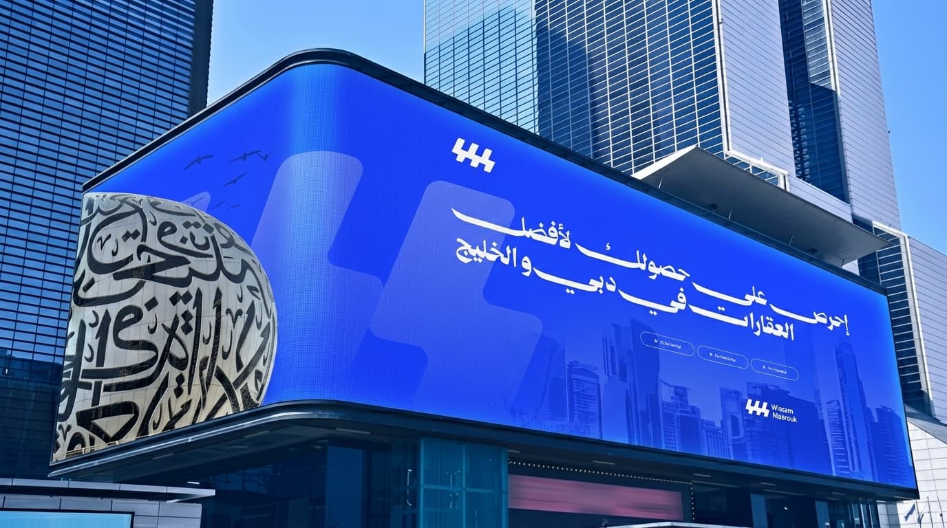
A full identity system for WM Real Estate (Wissam Mabrouk), a trust-first blue and green palette, a single flexible Poppins type system, and a geometric WM monogram built to carry the brand from a business card to a building sign.
Client
WM Real Estate (Wissam Mabrouk)
Date
June 2026
Service
Branding
The Brief
Wissam Mabrouk (WM) Real Estate has built its name on trust, customer satisfaction, and sustainable development. With a highly professional team that stays constantly available, the company stands out through innovative eco-friendly projects and strategic collaborations that power meaningful community events.
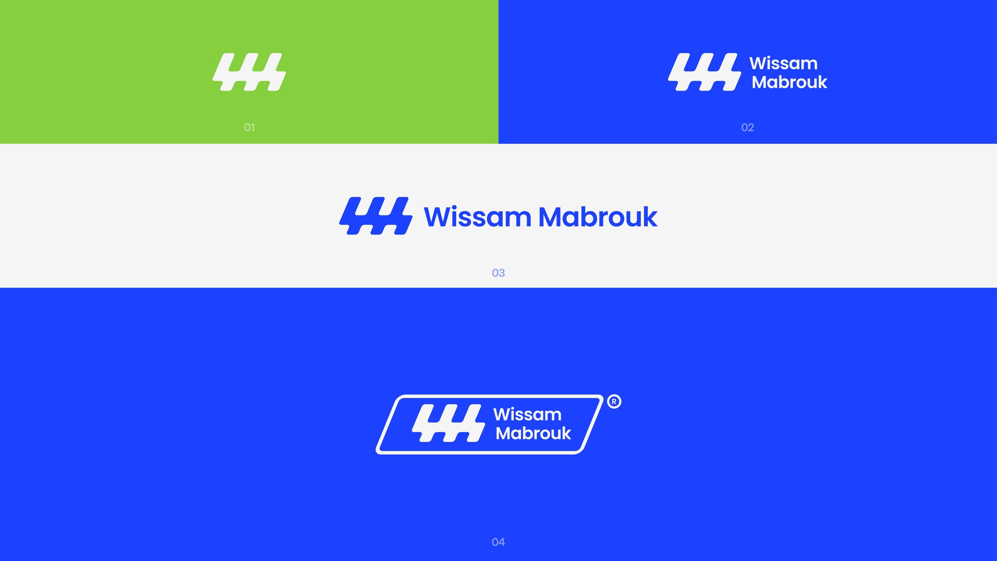
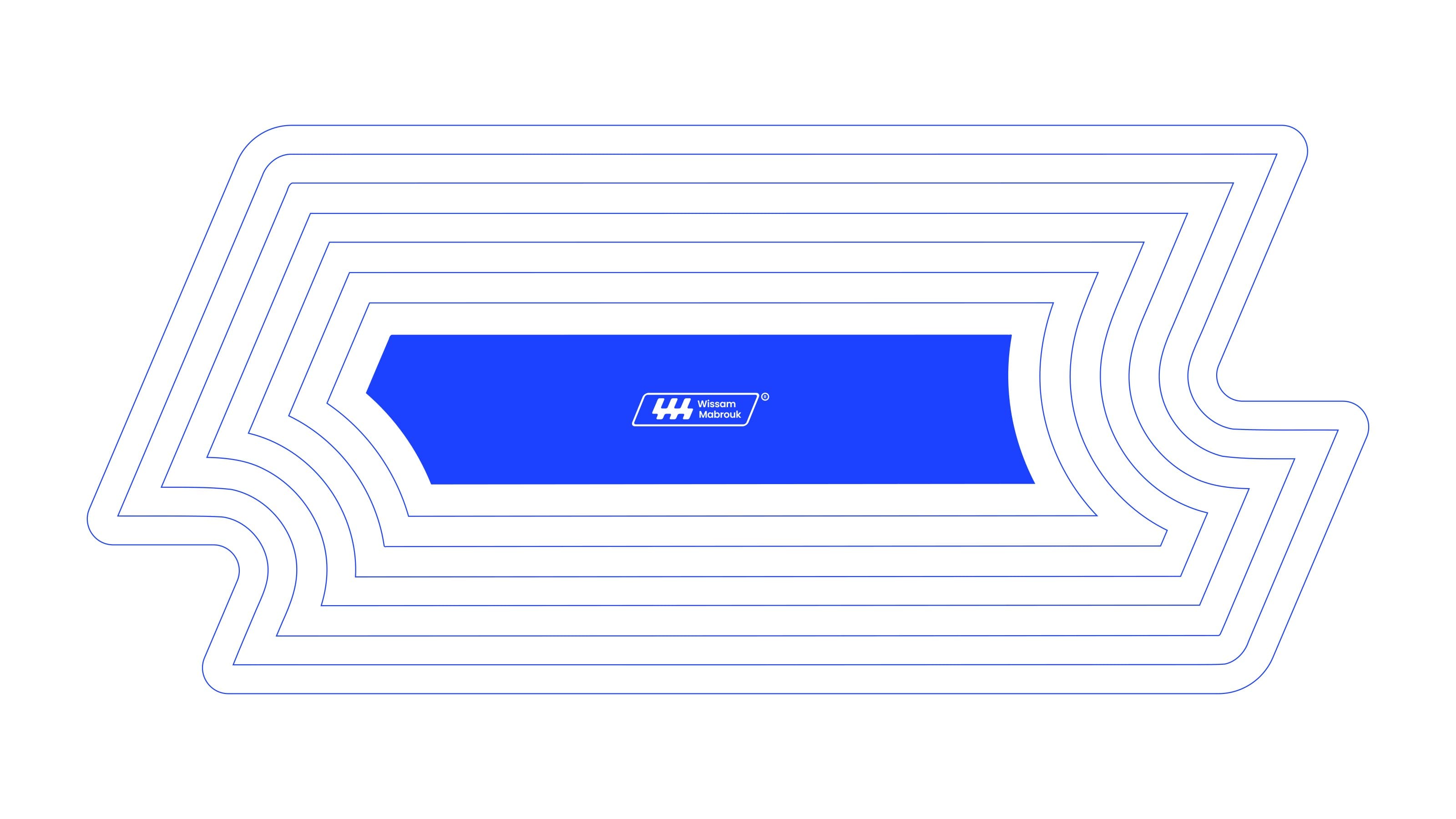
We translated that reliability into a calm, confident visual language: a blue and green palette rooted in the eco-driven brand, a single flexible typeface that keeps every touchpoint consistent, and a geometric WM monogram engineered to stay legible from a favicon to a building sign.
Brand System
One tight system, palette, type, and logo, tuned to make every property touchpoint feel trustworthy and effortless.
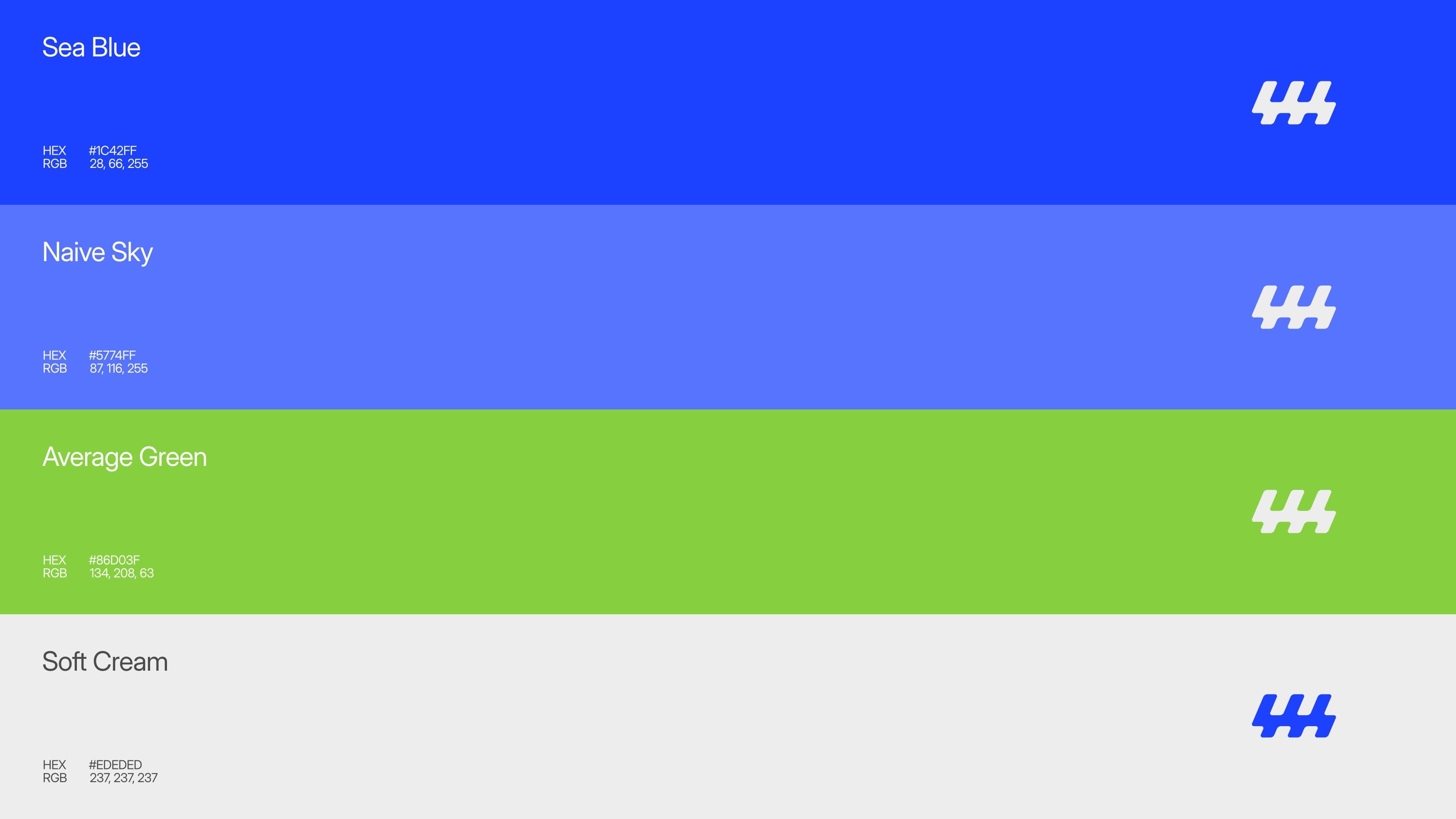
Palette
Trust Blue
#1c42ff
Off White
#f6f6f6
Eco Green
#86d03f
Soft Blue
#5774ff
Typography
Aa
Poppins · Display
Aa
Poppins · Headline
Aa
Poppins · Body
Logo
.jpg&w=3840&q=75)
.jpg&w=3840&q=75)
.jpg&w=3840&q=75)
.jpg&w=3840&q=75)
.jpg&w=3840&q=75)
.jpg&w=3840&q=75)
.jpg&w=3840&q=75)
.jpg&w=3840&q=75)
.jpg&w=3840&q=75)
.jpg&w=3840&q=75)
.jpg&w=3840&q=75)
.jpg&w=3840&q=75)
.jpg&w=3840&q=75)
Brand Guidelines
A single overview spread captures the essence of the system: the WM monogram, the palette, and the type at a glance.
.jpg&w=3840&q=75)